Awards : Nomination Award 提名奖
Category : Communication 视觉传达
Designer : 吴炜晨
Platinum Originality
吴炜晨
杭州,中国
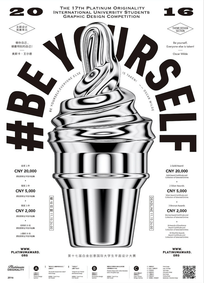
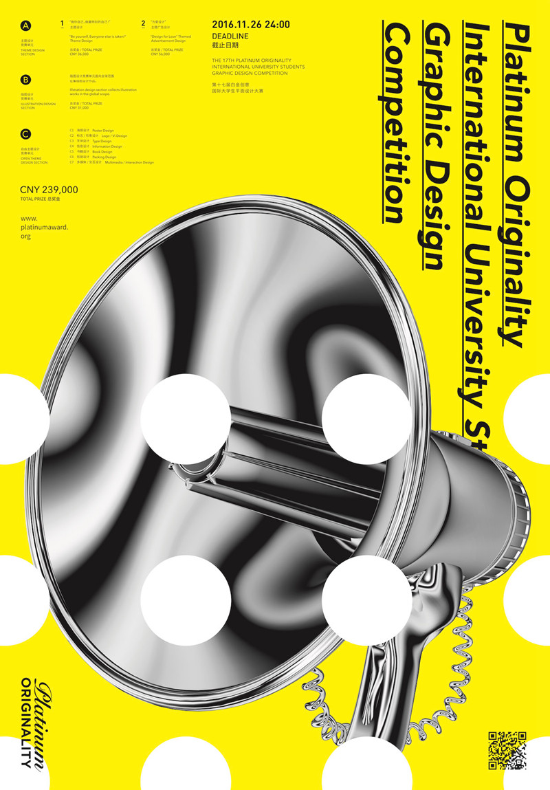
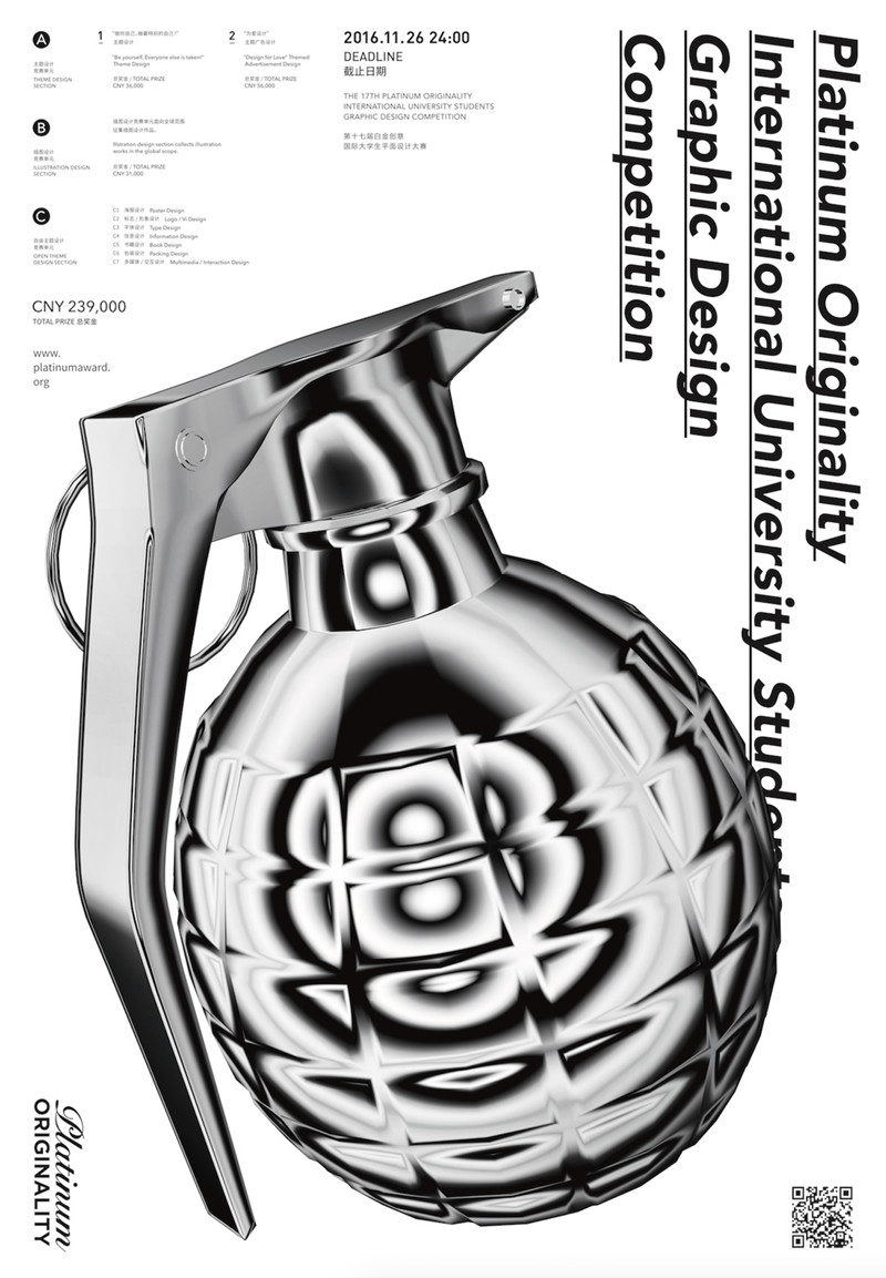
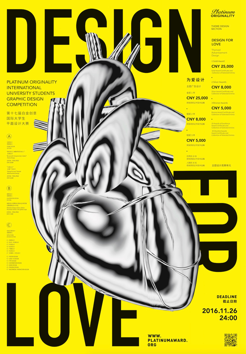
The visual image design of the 2016 platinum originality is dominated by the pattern of metal texture's black and white gradient tone, and the color is dominated by black, white and yellow. It has a strong visual impact with several other bright auxiliary colors to highlight creativity and unique character. Based on the concept of objects in daily life, we make contradiction,inelasticity and freshness by changing original texture of those objects.At the same time, different objects are given the same material so that they have a visual connection. The arrangement and combination of different words and graphics make people associate. The independent objects is more expressive, and echoes the design theme concept. It means more design works with unique creativity will appear on the platform of platinum. The main figure is composed of horn, hand grenade, brain, heart, brush, thumbtack, ice cream, etc., which are characterized by distinct personality and rich in idea implication.Those main objects are designed through model building which metal material is used to express platinum texture and form patterns with rich details and individuality. In addition, the English letters of name of this creative activity are expressed with approximate geometric modeling, and the same metal materials are used as auxiliary visual elements. The whole set have strong visual contrast with rich text layout and a great sense of space.
2016白金创意视觉形象设计以金属质感黑白渐变色调图形为主,以黑、白、黄色为主色调,具有强烈视觉冲击力,搭配其他几个鲜艳的辅助色,凸显创造力与独特个性。基于“⽇常的物体”这一概念设计,通过改变物体原有的质感制造矛盾,产生陌生感。并赋予相同材质,使不同物体有了视觉上的关联。不同的文字图形的排列和组合使人联想,独立的“物体”更具传达性,呼应设计主题概念,寓意更多富有独特创造力的设计作品在白金这一赛事平台上涌现。 主图形选取喇叭、手雷、大脑、心脏、刷子、图钉、冰淇淋等具有鲜明个性又富含想法寓意的图形,通过模型建立赋予金属材质以体现白金质感,形成具有丰富细节又个性张扬的图案。此外将白金创意的英文名称字母用近似几何造型表达,采用同样的金属材质作为辅助视觉元素。整套视觉对比强烈,文字编排层次丰富,具有空间感。 2016白金创意视觉形象具有强烈视觉冲击力,运用充满时代、年轻、个性、张扬的设计语言表达了白金创意所要传播的理念与想法。


