Awards : Bronze Award 铜奖
Category : Communication 视觉传达
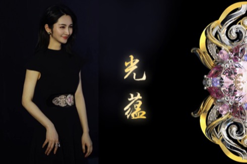
The beauty of the Chinese built pottery is not only in color, but also in shape. The bone of the pottery is the soul of the pottery. The logo takes the four types of the pottery (binding, closing, opening, and skimming) as the starting point to convey the light, implicit, and refined aesthetics of the Song Dynasty. The logo is flexible and changeable, and can be combined freely. The font part is derived from the characteristics of the iron wire seal strokes, which is smooth and flexible, like the cone painting sand, smooth and meaningful.
中国建盏之美,不止在色,更在于形,器物的骨感是器物的灵魂,logo以建盏的四大类型(束口、敛口、敞口、撇口)为切入点,传递建盏清淡含蓄、洗炼悠远的宋代美学,logo灵活多变,可以自由组合,字体部分取意于铁丝篆的笔画特点,舒展流畅富有弹性,犹如锥画沙,流畅隽永。
fL8EH8wLe0EVtE80VMSZIN8H1677331568877.jpg)
MxnSf8GTY1rYoNL4b9euZopP1677331578939.jpg)
T00xR094TCoQ41xrP6mb8P1f1677331573681.jpg)