Awards : Nomination Award 提名奖
Category : Communication 视觉传达
Designer : 张昊
Tino traditional series font 天诺传统系列字体
张昊
深圳,中国
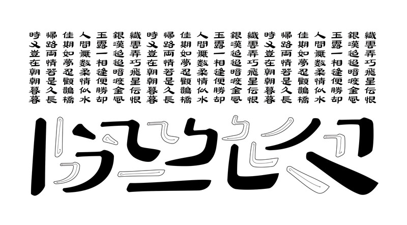
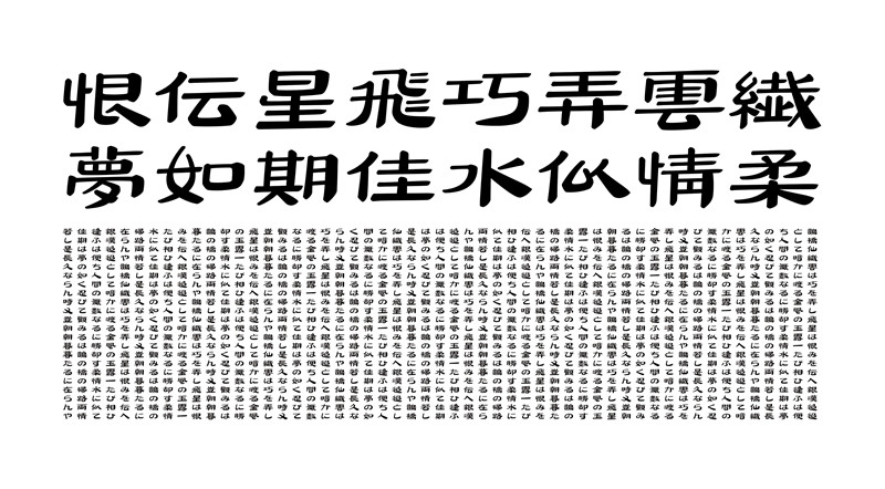
TINO Moist regular script | When the ancient Chinese make characters, they absorb what they observe from nature. This work was inspired by the changing seasons at early spring, with trees sprouting and snow melting. It draws features from regular script, reorganizing the structures and strokes. The Dot stroke is like a leaflet, the horizontal stroke a burgeon, the vertical stroke a bamboo, the left and right falling strokes are like weeping willows, and hooks are melting ice. Tino shooting stars silk script | Absorbing the feature of the “Bo” manuscripts in the last period of Han Dynasty, the design of Tino shooting stars silk script was designed and modified based on the need of modern font banks. Its horizontal strokes are characterized with a rectangle-shaped start but a sharp end, as its left-falling and right-falling strokes provoke a violent contrast. The design conceals an abundant tension within its smooth texture, revealing the remarkable charm of the work. Filling the gap of modern font design, Tino shooting stars silk script can be easily applied in the brand and package designs of various fields, such as art design, catering, liquor, candies, fashion retailing and etc.
天诺传统系列字体植根传统,坚持创新,获得了从字库公司到社会公众、从专业奖项到设计实践的认可,有广阔的应用空间。 根据赛事要求,选取四套如下: 方正天诺润楷 | 从柳公权书法获得灵感,有感于冬去春来的自然变化,将汉字结构和笔画重组。点如小叶,横如嫩枝,竖如翠竹,撇捺如垂柳,勾提简化如融冰。幽雅秀丽,润泽清新。适合文化、女性、时尚、餐饮等领域。 天诺帛书飞星体 | 从马王堆帛书获得灵感,帛书是由篆入隶时期书体,具有独特审美价值。根据现代需要加以改造,横笔划方入尖收,左波右磔对比强烈,骨气洞达,神采丰厚。适合文化、传统、包装等领域。 方正天诺教科书童楷系列字体 | 从颜真卿多宝塔碑中获得灵感,融合黑体骨架,字面大、中宫松、笔画粗度近似;符合儿童心理和生理特点,保护视力,有利于儿童辨认、记忆乃至摹写;包含准童楷和中童楷两款。适合教材、绘本、童话等儿童出版领域。 汉仪天诺丽线系列字体 | 从敦煌太守裴岑纪功碑(清重刻)中获得灵感,用单线概括结构。笔画纤细如线、刚劲如铁;结构上减少篆的圆融婉转,多了几分拙朴;整体兼具时尚感和传统气韵。适合女性、时尚、文化、包装等领域。